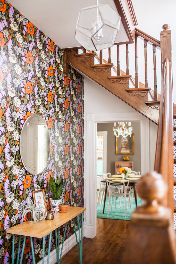
(photo by Elise Abigail Randolph)
Our entryway is another big change in our house! Honestly, I've never had an entryway before, so this was new territory for me. Do I set up a gallery wall? Do I paint the space? It was basically a blank canvas and it wasn't until we had the wallpaper installed in the living room that I KNEW wallpaper would be the perfect first impression as you walk into our home! Wanna see what it looked like before? This one of my favorite before and after spaces!!
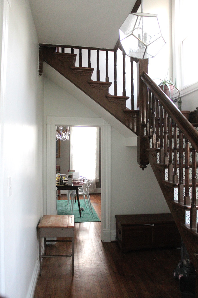
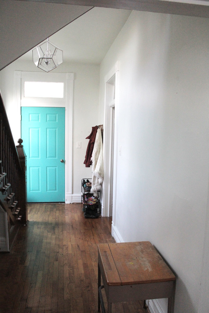
I found TONS of wallpaper I liked as I was searching, but just because you like something doesn't mean you can afford it. Oof. I found both of the wallpaper designs we used in the living room and the entryway at Wallpaper Direct. A friend asked how I came to the decision for this bold selection, and honestly, it took me over a dozen wallpaper samples to settle on something. You never completely know how it's going to look until it has been installed, so I'm EXTREMELY HAPPY with how this turned out! Sometimes you just have to take a deep breath and go with your gut!
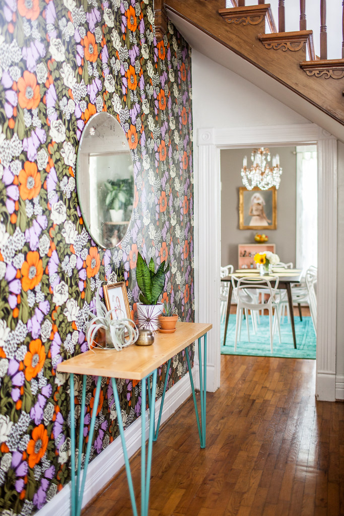
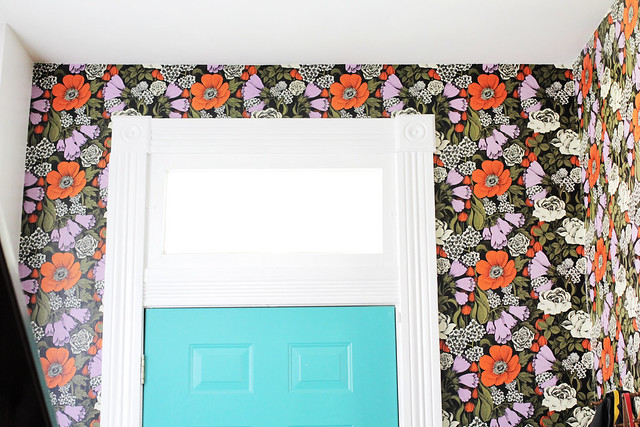
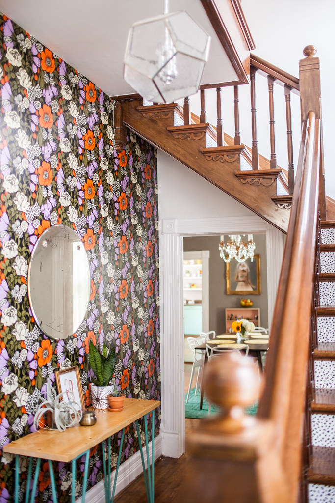
(Most photos by Elise Abigail Randolph-- a couple are my own)
I love the contrast of the teal door and table legs, and the peeks of teal in the other rooms with these colors! I'm so glad I didn't shy away from the boldness of the pattern-- it makes such a difference in this room! I'll be back soon with a better look at our dining room! xo.
Sources-- Wallpaper: Wallpaper Direct; Table: Hobby Lobby; Mirror: Craigslist; Family Portrait: Pop Pop Portraits; Candle: UO; Large airplant: Bowood Farms


Wonderful wallpaper. I love it so much. And it is perfect for your hallway!!!
ReplyDeleteGreetings & Love
Ines
www.eclectichamilton.de
Oh wow, it looks amazing! x
ReplyDeleteThe combination of this big bold statement with the gorgeous print on the stairs is so, just, stunning! I love mixing patterns and this was perfect. Your gut was spot on!
ReplyDeleteAnd that little illustration captured your essence completely. :) I hope you're loving your new home so much.
I love it! It's way better than if you had chosen a neutral color. Makes me happy just looking at it.
ReplyDeleteSTUNNING!!!!!! Soup jelly.
ReplyDeleteIt looks amazing and so fun! I remember seeing a sneak of it a few months ago on instagram maybe, and I remember thinking how bold that paper was! It's actually turned out amazing! And I love the pop of turquoise from the door and legs too! Do you want to come and decorate my house haha?!
ReplyDeletexo April | April Everyday
Gosh it certainly has impact. The wall paper really ties in well with the wall color in your dining area and the little white daisies? In the wall paper tie in really well with the white and black? Dotted risers in your stairs. Gold call, Katie but it really works so well and ties in so beautifully with the stairwell area and your dinning area. You should be super proud of your choice. Love the print of your family, simply gorgeous. I love too, that you have the courage to out your choices out on the web. I'm getting more confident as I get older, I'm 45 - so a little slow in this area - but it does seem to take time. Looking forward to seeing your next room makeover.
ReplyDeleteSo cute.
ReplyDeleteDid you change the color of the stairs or is that just due to lighting?
Your entryway is a stunner! Good choice. I love that you went something bold and that you're not afraid of color. So many people are. The picture of the family was so lovely too. I'm so jelly! :-)
ReplyDeleteSo lovely--not sure if I missed it, but who by chance drew that lovely portrait? I would love to have one of my own little family :)
ReplyDelete