I've gotten so many positive comments on my new logo, I thought I would talk a little more about it and take you through the process of how it came to be.
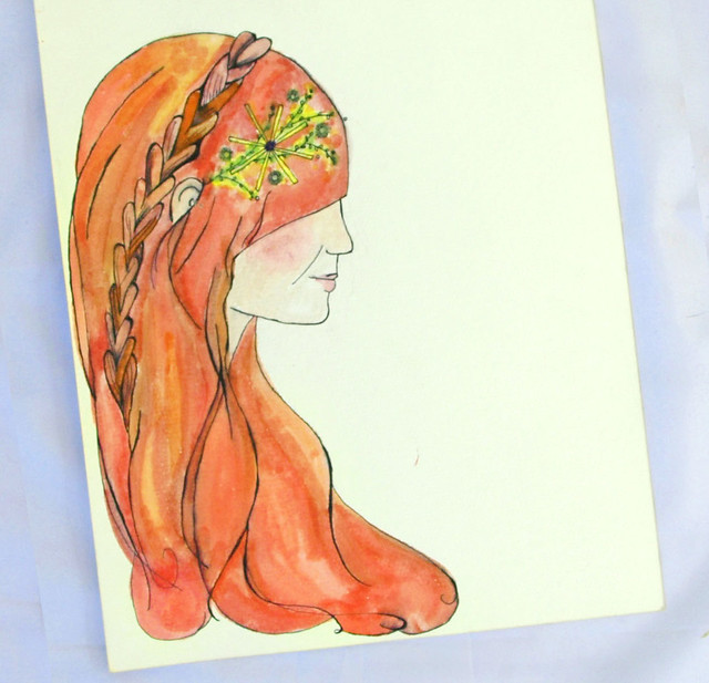
At the end of last year, my sweet friend Beca emailed me a photo of a painting she did (of me) just for fun. It was a lovely little watercolor piece that stuck in the back of my mind until I started my blog makeover obsession early this year. I'm not really a design gal... I know what I like and what I don't like, but when it comes to designing a site, I'm not the person for the job. So, as I was racking my brain for ideas and trying to decide a design "direction", I contacted Beca about doing a custom portrait for the new blog. Beca agreed, and we had our first bit of logo and color inspiration. Here's Beca's portrait:
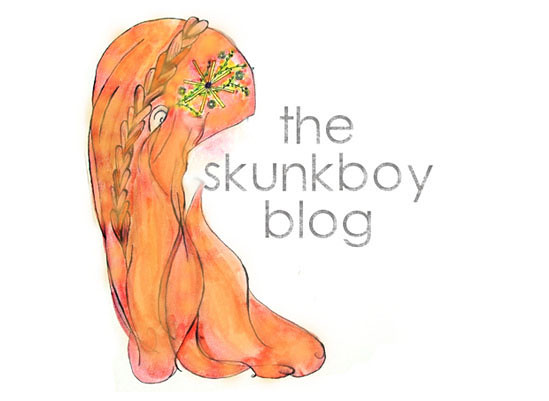
While I loved the painting, I was still unsure of how to use it as/in a logo. I knew I wanted to incorporate it somehow, talked to a few friends about it, and spent many hours obsessing. Here's how I thought to use it:
(This was a very rough mock-up.) I took out the face and placed the hair around the name of the blog in hopes of creating a logo or header for the new design. Though I liked the concept of the hair without a distinct face, I still wasn't satisfied with the results I was coming up with. At this point I knew it was time to bring in an outside source. Enter: Jill.
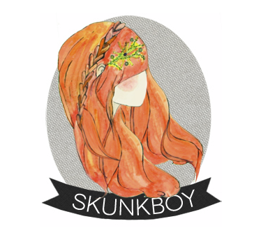
Jill's blog Lune Vintage always has an amazing design and a beautiful, clean aesthetic. I have much, MUCH respect for Jill. I emailed her and told her about my predicament, and included the original painting and the rough design. I asked her to work some magic, and the end result? Killer.
Nope. I can't even...
Folks, this is the perfect example of why you SHOULD bring in an outside source for designy stuff (unless, of course, you are a designer). Jill took a lovely painting and a very rough idea and turned it into my favorite, favorite logo... ever. It was everything I wanted and more.
This isn't a campaign for everyone to contact Jill for logo design, because that's not the point at all. Here's the point: if you are struggling with design stuff, find someone you respect and get some input. Sometimes it's hard to take yourself outside of your notebook of ideas to see what potential there is. Beca and Jill helped make my blog something I'm so proud to show off to anyone!


This comment has been removed by the author.
ReplyDeleteIt's really pretty! I recently had my blog made over as well after tinkering with it for months. I finally turned to a blogger/graphic designer for help. I'm so happy with how it turned out!
ReplyDeleteI'm so glad you posted this because I've been stalking your blog trying to figure out who created your new logo!. Love it.
ReplyDeleteI really like how your idea of removing the face. Reminds me a lot of how fairies were drawn on a virtual pet site (yes I am admitting it) that I used to play on a long time ago. Absolulty stunning!
ReplyDelete- Angela Marie @ http://sunkissedivory.blogspot.com
That's a piece of advice that I really needed! I've been thinking about my logo a lot and I think that the best idea is to "have a second opinion" from someone "outside MY box".
ReplyDeleteYour new logo is great and represents you perfectly!
i really adore the new logo and how awesome to see the design process!
ReplyDeletexo,
Steffy
http://steffysprosandcons.blogspot.com
i couldn't possibly love the new look more katie! its so perfectly you!
ReplyDeleteI agree with everyone, your new logo is adorable! So pretty and so YOU!
ReplyDeletex
emilythelwell.blogspot.co.uk
I really related to this post. I currently have a major obsession with giving my blog a new look and it seems no matter how much work I put into it, I'm constantly changing it. I think looking to others for help and inspiration would really open my eyes to ideas that I wouldn't creatively be able to execute on my own. Thanks for the advice. xo
ReplyDeletehttp://www.insidethebirdcage.com
It is so beautiful! What a sweet friend to send you a little painting of you to begin with, that's a great place to be able to start from. I don't even know where to begin!!
ReplyDeleteThis is brilliant! Ever since I started my shop I had been trying to make up a logo for it and kept coming up short. I love how your logo came out. It shows how much it really helps to have someone else's artistic talents involved as well.
ReplyDelete-Lauren
FrenchNavyVintage.blogspot.com
I love the new look! and I agree that it is so smart to bring in outside help. Everyone excels at something - I cannot do it all myself :).
ReplyDeleteThey did such a lovely job! How exciting it must have been to finally hit the jackpot with the design you loved =)
ReplyDelete- Sarah
agirlintransit.blogspot.com
I absolutely love this post. The conceptual ideas and steps that other designers take with their work is just inspiring!
ReplyDeleteMichelle
www.michelleesque.com
Such an amazing job by all. I love the new layout. Simple but effective! xo
ReplyDeletesuper cute!
ReplyDeleteSuch a great post. I've been considering contacting a designer for a logo and blog design. It's great to read about somebody else's experience.
ReplyDeleteBecky
xx
http://www.beckybedbug.com
It is beautiful!
ReplyDeleteI assume Beca is not a graphic designer, because why on earth would anyone use such detail on a draft? If you're still seeking angles and possibilities you should stay with sketches! It's not time efficient to work like that but nevertheless, cute and something to be proud of ladies.
ReplyDeleteBeca is not a graphic designer and neither am I. She paints for pleasure and I was happy to be a recipient of one of her lovely paintings. There was no talk of drafts, angles, or sketches... just a sweet gal making something pretty and heartfelt.
DeleteI saw your logo a couple of days ago, and ever since then I've been on my own little redesign kick! I love the look of your blog right now :) Definitely one of the blog layouts that is inspiring me right now!
ReplyDeletexo Heather
http://ahopelessnotebook.blogspot.com/
Well I'm a fan of it! So cute!
ReplyDelete-Kate
I love love love the new look! So clean and fresh.
ReplyDeleteIt is quite special!
ReplyDeleteI adore your logo!
ReplyDeleteIts simple, whimsical and lovely
wow so good!
ReplyDeleteI am also thinking about finding a designer for my blog :)) I see it is not a bad idea at all ;)
definitely love your new logo! it is so cute. i love that it is faceless too.
ReplyDeletehttp://challengedromantic.blogspot.com/
I love it! :)
ReplyDeleteI love reading about the design process- thanks for sharing this 'behind the scenes'!
ReplyDeleteI had so much fun working with this pretty painting. It evolved itself. I'm so happy you and your readers love it Katie. I really do.
ReplyDeleteThis is lovely. Red hair is the BEST to illustrate. xo.
ReplyDeleteReally love the logo, that painting is lovely. Watercolours are always great, I miss using them! But I do have an obsession with design, especially recently with my blog haha. Your new layout is lovely, simple yet effective :)
ReplyDeleteFollow back if you get a chance :) From Cupcakes, With Love x
I wish I had a pretty logo, like yoursssss <3
ReplyDeleteI love how this logo turned out, but I keep reading it as Lego in my list of blogs and think that's hilarious too
ReplyDeleteJill was the way to go, she has impecable taste and your a lucky girl to have her as friend. I'm so jealous.
ReplyDeleteVintagehoneybee.blogspot.com
I am currently working on a new logo and general branding makeover, so this was hugely helpful! Lucky for me, my boyfriend is a graphic designer. Unlucky for me, I like flowers and watercolors and he has a very modern, clean cut design aesthetic. I am hoping we can meet somewhere in the middle! Thanks for the inspiration!
ReplyDeletexo Hannah
Love seeing the process of how your new logo came into being - thanks for posting about it!
ReplyDeleteoh my goodness I love it. I need to jump out of my Reader more, i see you have email subscription option, my favorite way to read my favorite blogs.
ReplyDeleteIt seriously looks amazing, they did a fabulous job.
Your new logo is beautiful :)
ReplyDeletelove love love the blog redesign. It is so pretty and nice.
ReplyDeleteI also feel that white background highlight your colorful
life even more.
It is very nice indeed :)
ReplyDeleteVal
http://www.valentinaduracinsky.blogspot.com/
LOVE this imagery! Really pretty & emulates your blog beautifully.
ReplyDeletexx. Jillian
boyishchic.blogspot.com
I really adore the new look of your blog. This painting is just wonderful. It's so nice to have talented and creative friends :)
ReplyDeleteGreat!! This is really helpful!! Display cases, thanks for sharing with us this info about uploading a logo on your blogger site. Just when I was thinking about quitting blogger for other blogging domains, I find very useful information about updating my blog.logo design
ReplyDeleteWhat a useful sharing, A new Logo Designs give the new look to your blog In other words, it acts as a means of communication between you and new visitors. Thanks
ReplyDeletegood to read this article, this is very informative for me.
ReplyDeleteprovillus for men